IT Patagonia
Clarifying product value through website experience
Role: Lead Product Designer · UX Strategist
Client: IT Patagonia - IT Services and IT Consulting
Timeline: Sep 2023 - Jan 2024
Context
IT Patagonia is a software development company helping global clients build digital products. As the company grew, the existing website no longer reflected its offerings, maturity, or positioning clearly:
Unclear value proposition for prospective clients.
Fragmented information architecture.
Visual inconsistency that diluted brand perception.
Limited support for business goals such as lead generation and credibility.
This led to missed opportunities for business engagement, unclear user expectations, and internal frustration around how the brand was represented.

Opportunity
The website needed to function as a clear, user-centered digital experience, not just a marketing asset.
The goal was to communicate IT Patagonia’s value, services, and expertise in a way that supported both user understanding and business goals, including trust, clarity and lead inquiries.
I led this redesign with a product mindset, focusing on information hierarchy, UX clarity, and visual confidence that aligned with the company’s positioning and growth ambitions.
Approach
I structured the work around how real users perceive, navigate, and evaluate a services website.
-
I began by understanding target users, including potential clients and internal stakeholders.
Then, I identified key questions users sought to answer on first visit:
What do they do?
How can they help me?
What outcomes can I expect?
-
I redesigned the site structure to prioritize key user questions and guide users through a clearer, more intuitive flow.
This reduced cognitive load and emphasized the company’s most strategic messages.
-
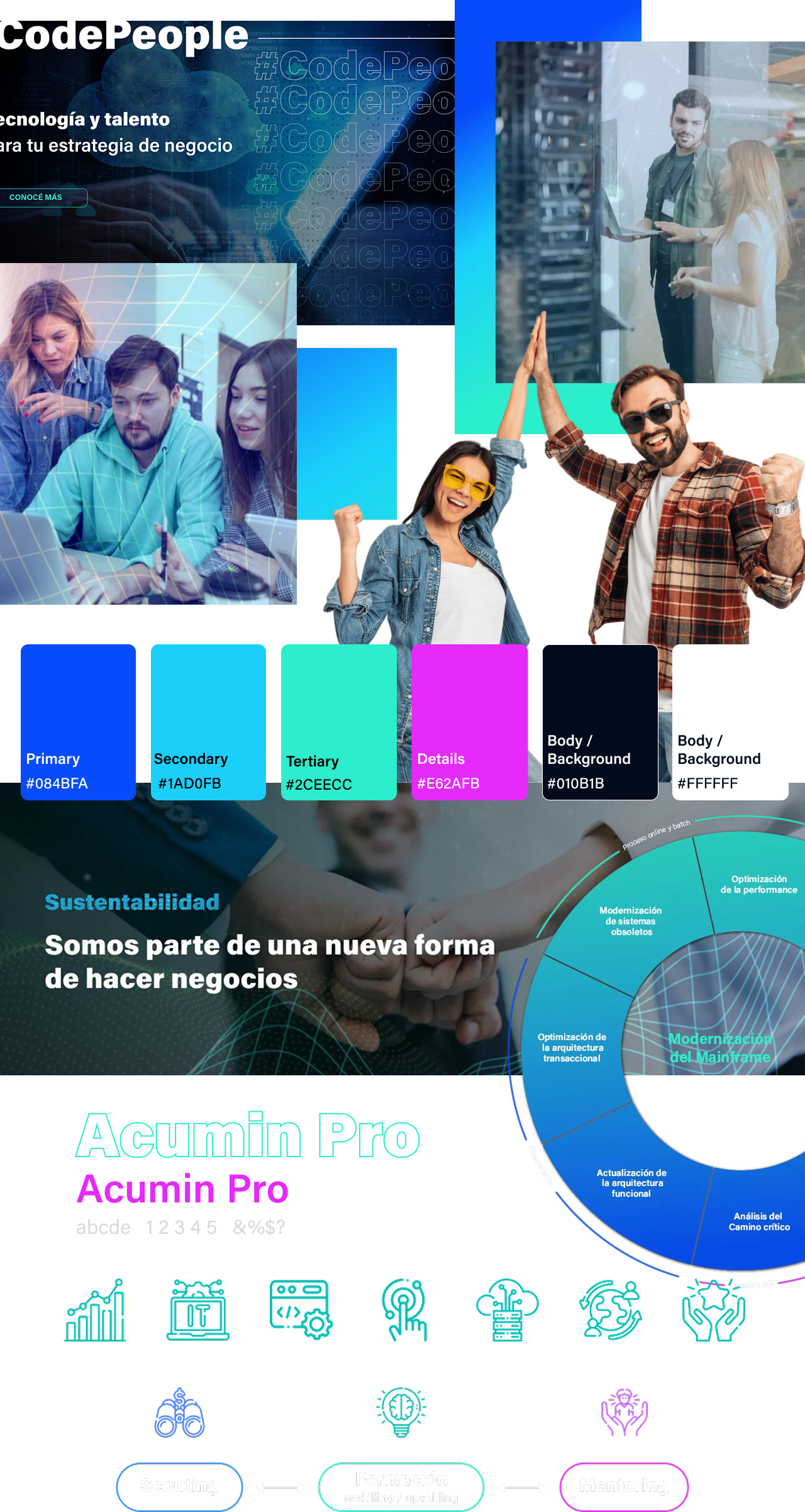
I translated brand positioning into a coherent visual and interaction language, focusing on clarity, consistency, and trust.
Visual hierarchy and layout decisions were grounded in usability and purpose.
-
I partnered with stakeholders, product, marketing and engineering teams to:
Validate content.
Refine messaging and business goals.
Ensure that design decisions supported both user needs and business objectives.
Key Decisions
Lead with value
Prioritized information and visual support that answered users’ core questions before showcasing specific services or technical details.
Simplify navigation and hierarchy
Reduced content load, improved interactions, and clarified pathways so users could find what they needed with minimal friction.
Visual design as a trust signal
Chose a clean, confident visual style that aligned with IT Patagonia’s brand maturity and communicated reliability.
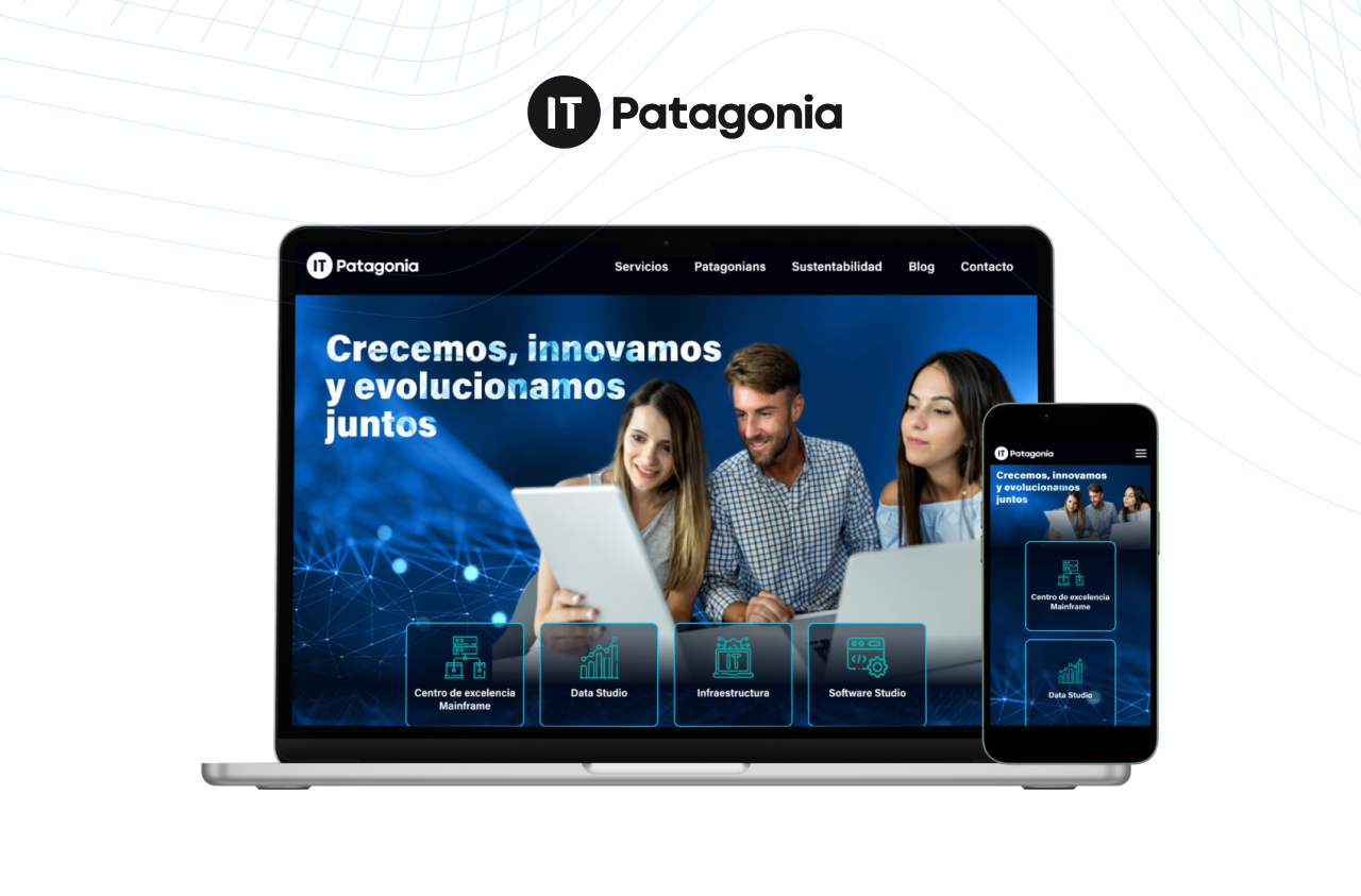
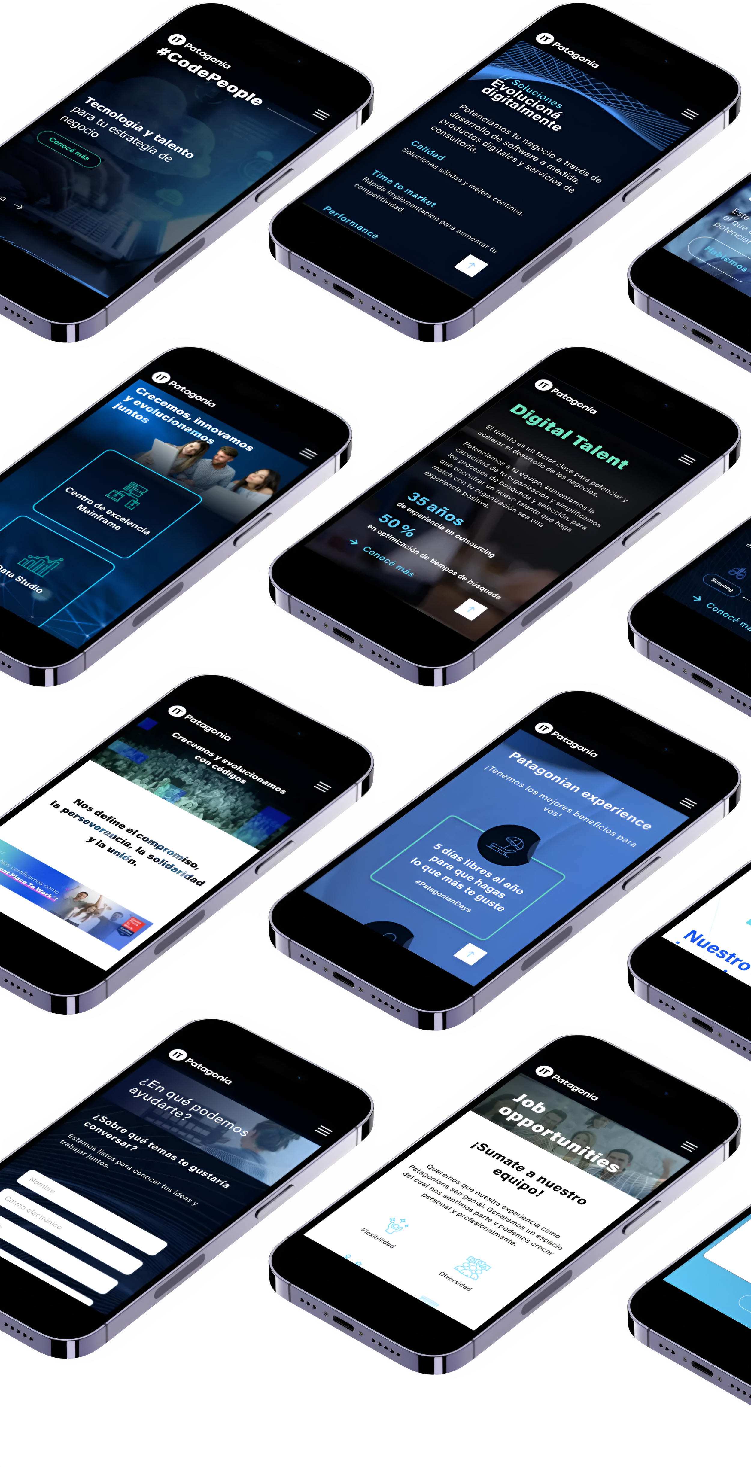
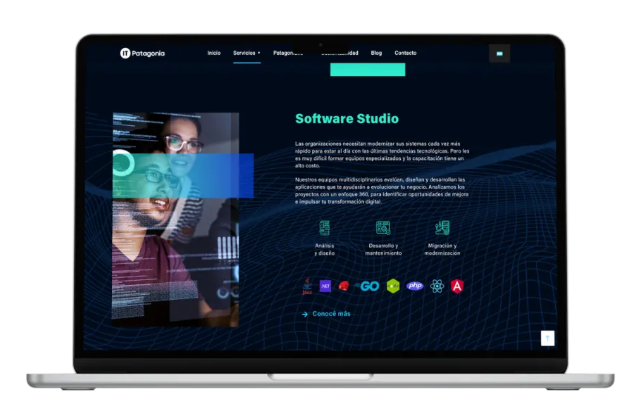
High fidelity prototype
Outcome
The redesigned website strengthened IT Patagonia’s digital presence as a clear, credible product and service offering.
Observed Outcomes
Improved how users understand and navigate services and capabilities in the website, with a more cohesive and mature visual language.
Business & Product signals
Strengthened trust and credibility: the site is an effective support tool for sales & business development, with a scalable foundation for future content & service expansion.
Validation
Aligned internal teams (marketing, leadership and product) around a shared narrative, improving clarity, usability, and brand perception.
While direct analytics were not available, post-launch feedback and adoption signals indicated the redesign successfully addressed usability, credibility, and positioning challenges. If I were to iterate further, I would partner with marketing to define and track conversion and engagement metrics aligned with business goals.
Learning
Redesigning for clarity in a services context reinforced the importance of aligning structure, messaging, and visual language with real user questions.
Working with stakeholders taught me how to balance internal priorities with user needs, and how strong information architecture can directly support business objectives.