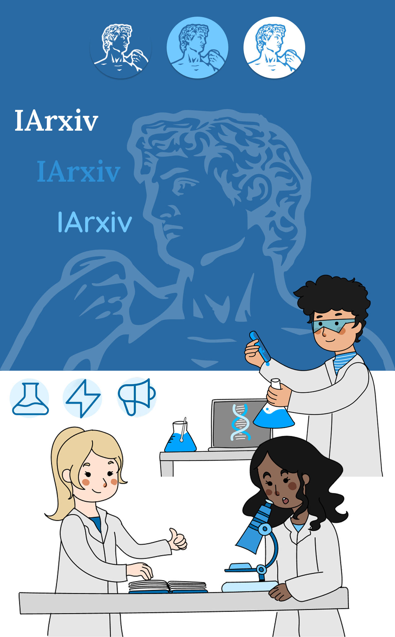
iArxiv
Redesigning a Machine-Learning-Driven scientific paper discovery tool
Role: Product Designer ∙ Illustrator
Client: arXiv - Machine-Learning-Driven Scientific Paper Discovery
Timeline: May 2022 - Feb 2023
Context
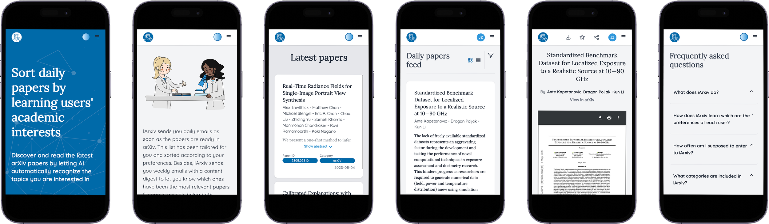
iArxiv is a platform created by a group of engineering students collaborating with scientific leaders in Argentina. Using Machine Learning, the system learns each scientist’s preferred research topics and automatically sorts daily arXiv.org papers based on individual interests.
The platform needed to elevate usability, remove friction, and bring clarity to a tool used by researchers multiple times a week, without losing the simplicity and minimalism valued by the scientific community.
Challenge
The platform’s experience fell short, with overly complex filters and workflows, confusing settings and lack of content hierarchy.
The result: users struggled to stay updated and to find relevant research efficiently, even though that was the core promise of the product.
The core challenge was designing an experience that allowed users to:
Understand complex information quickly
Navigate dense content without feeling overwhelmed
Maintain context while exploring related material
Without a strong structure, the experience risked becoming unusable despite valuable content.
Insights
To understand user patterns, we conducted a short survey (15 respondents) covering usage frequency, habits, and pain points. Despite the small sample, the findings were consistent across scientists.
Key insights were:
➤ Researchers use iArxiv 2 to 4 times per week to quickly scan new papers.
➤ Filters were the biggest friction, described as complex and difficult to use.
➤ Updates matter: users wante a mix of their main area + related domains.
➤ Settings were valuable but unclear, leading to trial-and-error.
➤ Paper overview is the determining factor for deciding whether to read more.
Approach
➤ Understanding content relationships
Mapped how information connected, overlapped, and branched.
➤ Designing for scanning and depth
Created entry points for quick understanding while supporting deeper exploration.
➤ System-first thinking
Treated content as a system that needed to scale and remain legible over time.
Key decisions
➤ Simplified filtering
Reorganized filters into logical, clear groups (date, score, category) and designed a smooth drawer interaction that reduces cognitive effort and decision time.
➤ Smarter, more discoverable settings
Users can now choose preferred categories, adjust scoring, decide whether to show abstracts and configure email updates, and create instant personalization.
➤ More actionable paper overviews
We designed multiple levels of overview clarity depending on what scientists valued in order to speed up scanning, the core use case.
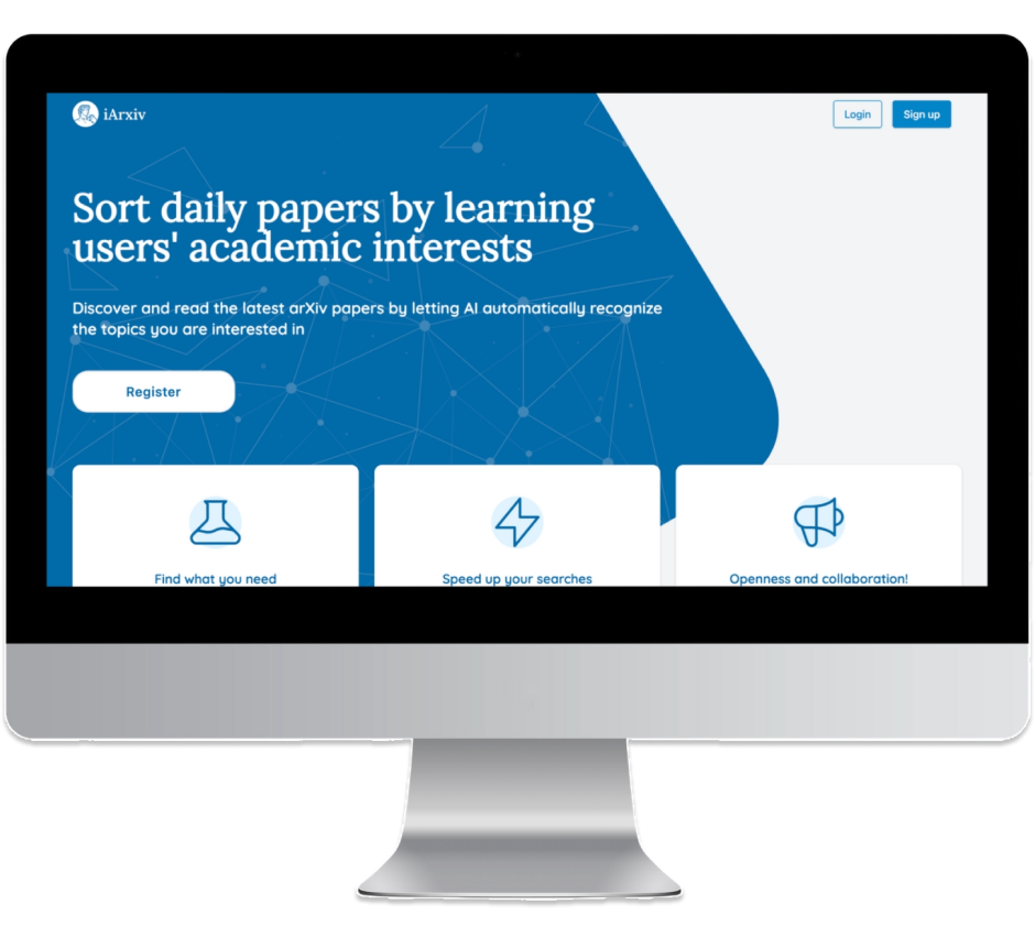
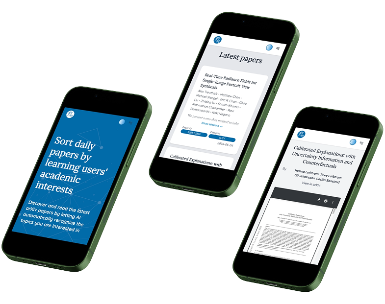
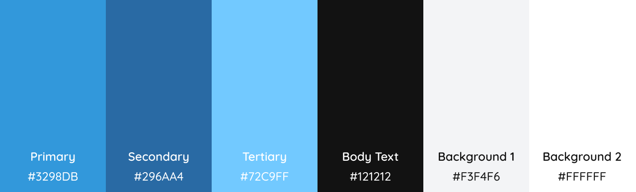
Branding & UI
We refreshed iArxiv identity keeping a light, minimal and trustworthy tone.
The visual direction blends scientific clarity with digital simplicity, supported by custom illustrations and a calm, research-friendly color palette.
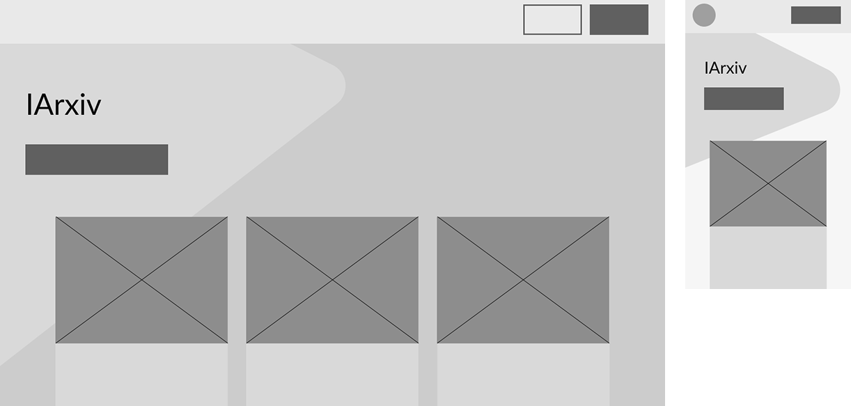
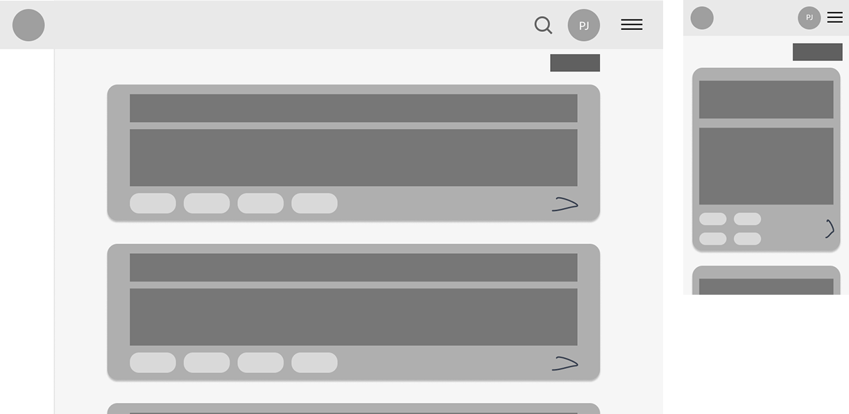
Wireframes
Outcome
The final experience delivers a faster, clearer, more navigable experience that made complex information easier to access and explore, tailored to scientists’ weekly routines.
Live version: https://iarxiv.vercel.app/ | Legacy: https://iarxiv.org/
Learnings
This project reinforced the importance of strong information architecture as a foundation for usability, especially in complex or content-dense domains.
iArxiv demonstrates my ability to design structure-first solutions for information-heavy products.