Asteria
Brand & concept design with strong narrative for a jewelry store
Role: Brand & Product Designer
Client: Asteria, jewelry store
Timeline: Oct - Nov 2025
Context
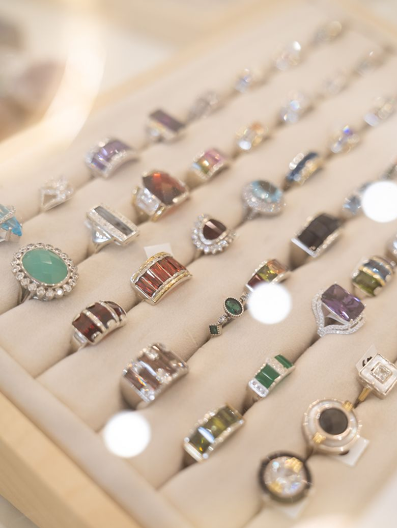
Asteria is a boutique jewellery studio located in Palermo Soho, Buenos Aires. The brand was born from a mother–daughter partnership, inspired by the family’s Venetian grandmother, Asteria. She was known for her love of gems, stones, and objects with emotional resonance. Her name —meaning “of the stars”— became the foundation for the brand’s identity.
The project goal was to create a complete brand universe, from concept and naming to visual language and system rules.
I aimed to establish a coherent identity framework that that captured this lineage: heritage + mythology + contemporary chic, expressed through refined simplicity.
Challenge
The jewelry market in Palermo Soho has two dominant extremes:
Ultra-minimalistic brands: clean, trend-driven, but emotionally flat.
Overly decorative brands: expressive but visually heavy or old-fashioned.
The main challenge was translating an abstract concept into a clear, recognizable identity without relying on existing product constraints.
Every decision needed to reinforce meaning, consistency, and future extensibility
soft
✦
mythic
✦
chic
✦
modern
✦
artisanal
✦
design-focused
✦
elevated
✦
soft ✦ mythic ✦ chic ✦ modern ✦ artisanal ✦ design-focused ✦ elevated ✦
And unique above all, reflecting the story of three generations of women connected through craft, metal, and light.
Opportunity
I was involved in the project end-to-end, responsible for:
Defining the conceptual foundation and narrative.
Developing the name and brand positioning.
Designing the logo system and visual language.
Establishing visual rules to ensure consistency and scalability.
It was important to make the visual language and foundations scalable, in order to adapt to future development (e.g., e-Commerce).

Key Insights
Three insights shaped the creative direction:
1. Jewellery is emotional storytelling.
People don’t buy metal, they buy meaning, memory, connection.
2. Luxury is shifting.
Modern luxury is quiet, intentional, and minimal, not ornamental.
3. Asteria’s value is its lineage.
Mother–daughter founders + heritage from the grandmother = natural symbolic system.
This became the conceptual core of the brand.
Asteria captures the instant when light touches material — when a gem glows, a metal reflects, a stone reveals its inner fire.
Brand Concept
My branding proposal was driven by emotion + craft + symbolism.
This concept translated into:
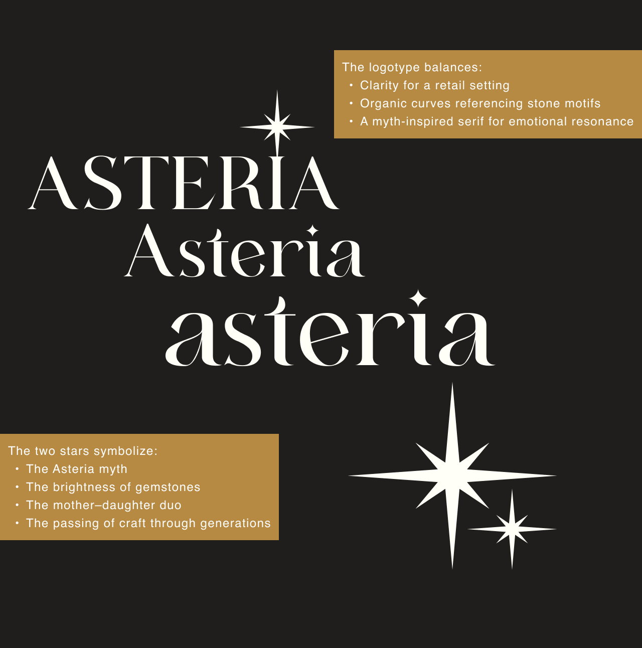
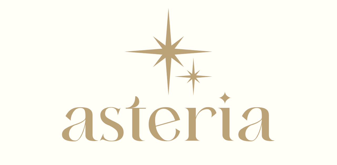
✦ A luminous, soft gold palette
✦ A serif type with organic, almost mythic curves
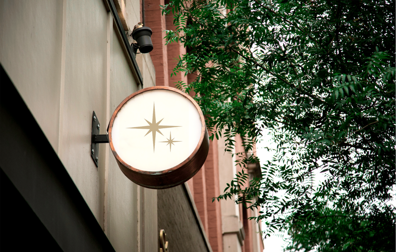
✦ A refined star symbol
✦ Dual stars → mother and daughter
✦ Composition that feels calm, intentional, crafted


Outcome
✦ A modern, refined brand deeply rooted in heritage
✦ A visual language that feels both mythic and contemporary
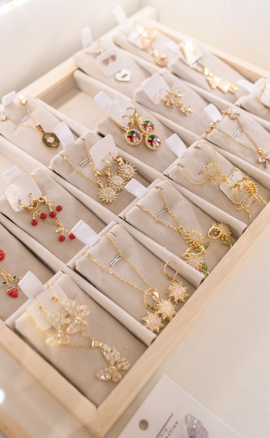
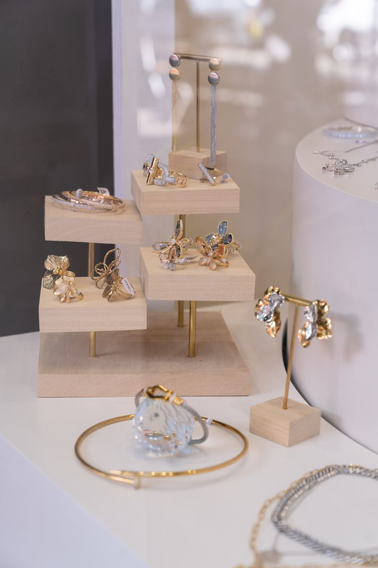
✦ A timeless palette that works across jewellery materials
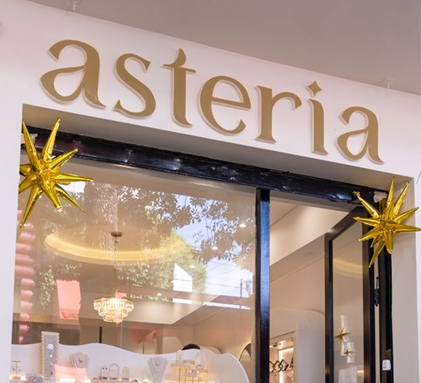
✦ A logo system expressive enough for luxury, minimal enough for modern retail
✦ Clear differentiation in a saturated boutique jewellery market
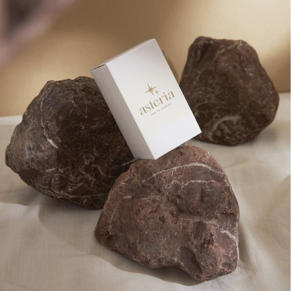
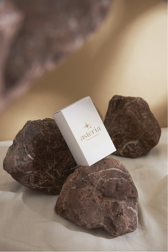
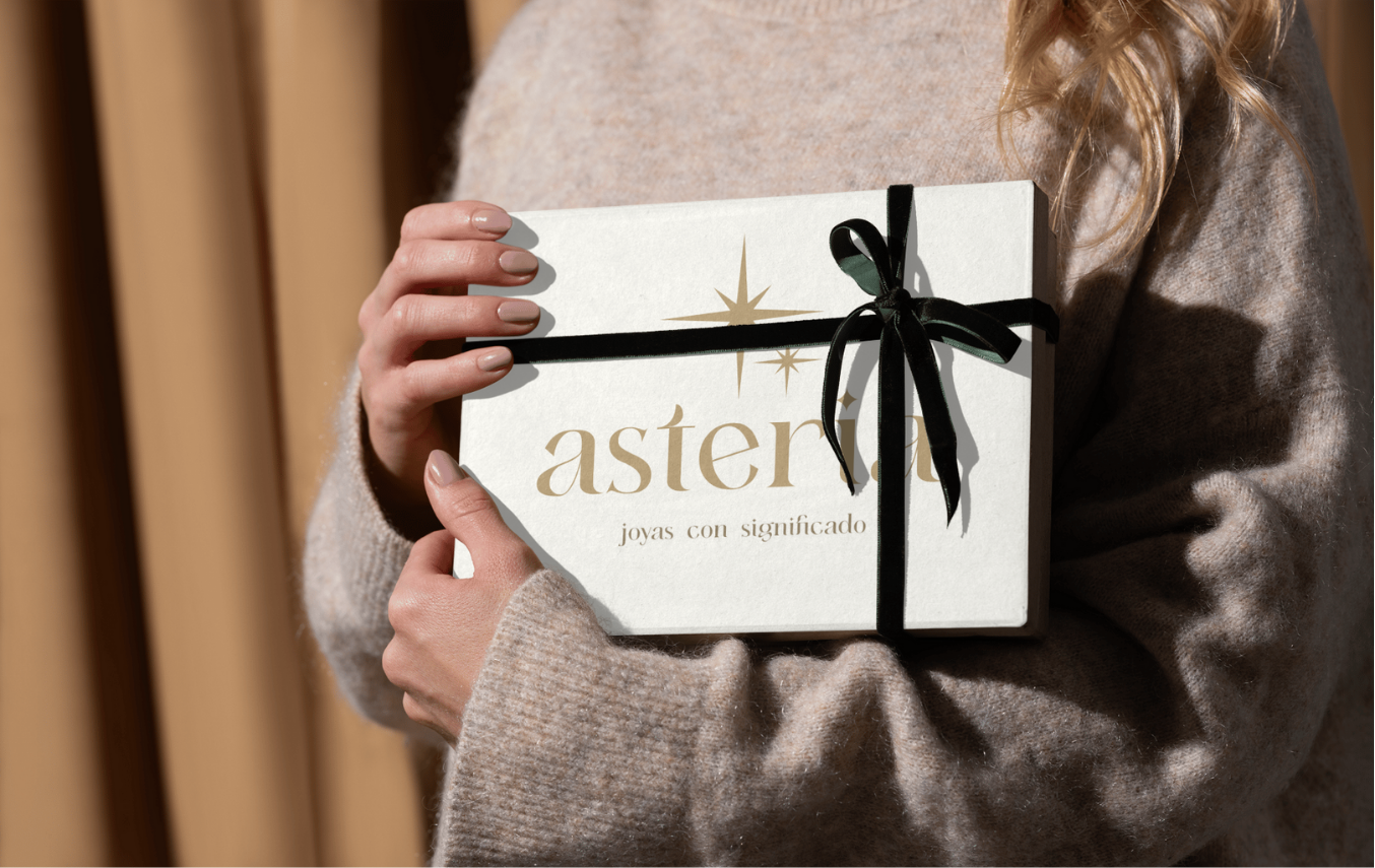
The identity now supports packaging, store visuals, product cards, branding for social content, labels, gift bags and e-commerce foundations.
Learnings
This project taught me the power of:
✦ Building brands from authentic stories.
✦ Designing with symbolic depth.
✦ Balancing editorial elegance with retail clarity.
Asteria showed me that when a brand has a true story, the design naturally aligns with its essence.

